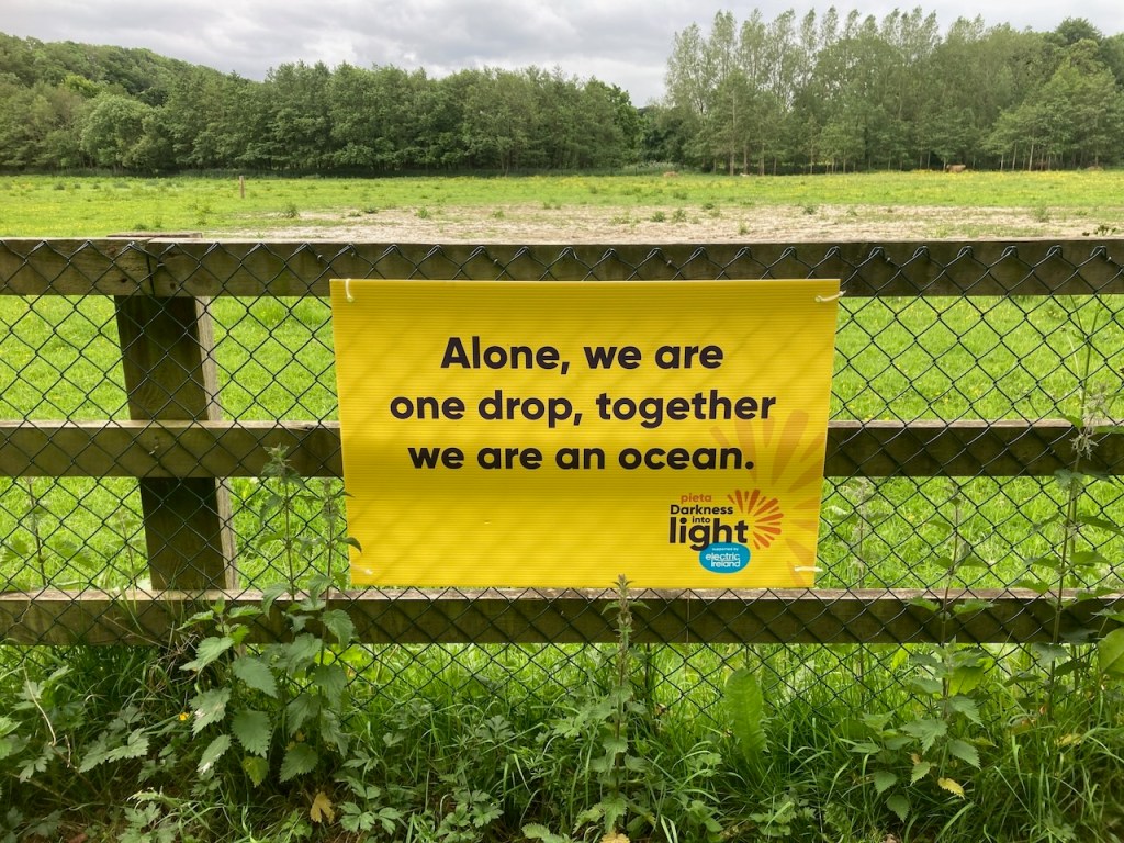
“Ladies and gentlemen of the jury, I put it to you that on the said date, Saturday 11th May, an egregious crime was committed in the vicinity of St. Catherine’s Park in Leixlip. A heinous act that has gone unchallenged for too long. An act of vandalism against good typographic layout that has caused unnecessary suffering in the graphic design community at large. I present to you… Exhibit A:”

Okay, I should probably tone down the sarcasm here. Darkness Into Light is actually a movement very close to my heart, and one I have participated in for some years. If you are not familiar with the idea, here is a primer. I doubt there is anyone out there who hasn’t been touched in some way by suicide, so I offer this little critique in as jovial a fashion is possible under the circumstances. Admittedly, jovial is not the right word here.
But damn it! This sign catches my eye several times a week as it’s on my regular flight path with the dogs, and when I’m off out for a run.
What’s wrong with it, you ask? It seems perfectly… cromulent!
Well, it isn’t.
And it isn’t because of the line breaks.
The layout artist in question here decided to do this idea in three lines. The sentiment is simple and powerful. Alone, we are one drop. Together, we are an ocean. It perfectly sums up the whole Darkness Into Light philosophy, and this year was the first time they had an official walk in my local park. And it was very powerful, because it took me by surprise. Hundreds and hundreds of folk streaming past, all with candles and lights as the dawn was breaking. It was truly wonderful.
The poster does indeed convey that message. But it fluffs its line, alas.
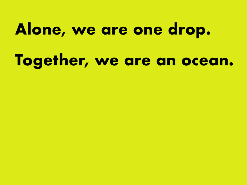
Here is how it should have been laid out:

It could have been done across two lines, but that would have made for a very long poster:

Which would have been fine if you wanted to design it that way, but given that most posters are some form A size in proportion (a standard sheet of paper is A4, unless you are American, in which case we cannot communicate anymore in terms of paper proportions and dimensions!), let’s stick with a standard landscape size. I think the original is A2, which is four sheets of A4, if you must know.
By choosing to break this phrase over three lines, the layout person has inadvertently and subtly changed the meaning, as well as creating clunky ‘speed bumps’ in the reading road; a path we aim to keep as smooth as possible when we are doing typographic layout.
Now it reads:
Alone we are
One drop together
We are an ocean
It may not seem much, but it has diminished the power of the message. There was plenty of room to do it over four lines. It’s possible someone stuck their oar in and wanted the logo bigger (this was a standard refrain to any freelance designer throughout their career), and so perhaps four lines became three. Yes. Let’s give the original designer the benefit of the doubt here. But they should have stuck to their guns.
Are there worse examples of bad line breaks? No doubt. I am not going to fish them out here. I just wanted to get this off my chest, and I have done so now.
The case rests…

Glad you got that off your chest 🤣
For what it’s worth I agree with you. I couldn’t tell you why but it just read wrong. I feel better now that you have explained why 😉😊
LikeLiked by 1 person
Glad to be of service 🤩
LikeLiked by 1 person
Ok – but now my actual comment disappeared from the above. (Sigh). Trying again.
I TOTALLY agree. Even before I got to your terrific post, even before I read your brilliant sarcasm (a language dear to my heart), I read the sign. Alone we are / One drop, together / We are an ocean. And I thought, wtaf is this? A crap haiku from someone who doesn’t understand the feckin’ rules of haiku?!?
Now I’m feeling kinda guilty for being so hard on the signage, as the organization behind it is a good one. Then again, I don’t have to see this awkward graphic several times a week. Goddess willing, I’ll never see it again.
LikeLiked by 1 person
Well, I too felt a little mean posting the critique. And in my defense, I held off for some considerable time!
LikeLiked by 1 person